

TRANSFORMATIONS – Modernity in the Third Republic – Exhibition Report
Although the political transformation was quickly noticeable - and often acutely felt - changes in the area of design were initially more discreet. Only with the development of industry did design begin to play an increasingly important role. Over time, its potential to solve social problems and shape quality of life was also recognized.
Design after 1989 – from market to responsibility
The political transformation after 1989 had a huge impact on the development of design in Poland. In the 1990s, design was overshadowed by rapid economic changes – there was a shortage of new products, and designers operated mainly on the borderline between art and utility. Aesthetically, postmodernism dominated, while applied art was the main design space.
With the development of industry and attempts to align with Western standards, design gradually regained its place in production processes. The next decade saw the emergence of a strong neo-modernist trend, and companies – both small and large – began to invest in visual identity and branding. Design acted as a marketing tool to promote modernity and competitiveness.
The beginning of the 21st century has brought further professionalization of design. In response to globalization and the rise of digital technologies, new models of production and consumption emerged – from modular systems to the replacement of ownership by use. At the same time, the market began to recognize the need to respond to real social and environmental problems.
After 2010, design began to be redefined – not only as a tool for economic growth, but also as a way of responding to contemporary challenges. Designers increasingly turned to themes of ecology, localism, identity or exclusion. The consumer ceased to be an abstract “user” and became an individual with diverse needs and sensitivities.
Contemporary design in Poland is a space of polyphony – combining aesthetics, functionality and social responsibility. It is also a field of experimentation and reflection, where design measures up to a dynamically changing world.
The exhibition consists of three parts:
-
Postmodernism in art and design was shown as a manifesto of transformative energy – from exclusive realizations to everyday objects that redefined the Polish reality of the years of transition.
-
Neomodernism, an expression of revived modernism, presents projects by Polish architects at a world-class level, while firmly rooted in the local context.
-
“Polyphony ” – a term introduced by the curators – emphasizes the diversity of contemporary creative attitudes, encompassing architecture and design, with an emphasis on issues of accessibility, relationship with nature and the search for identity.
The exhibition opens with photographic documentation of the so-called student events in Krakow.
![]()
Photographer: Tomasz Łojewski.
The photograph was taken during student demonstrations in the center of Krakow in 1988-1989. These were protests against the communist reality, organized by anti-communist student and youth organizations operating in the underground, the Independent Students’ Union and the Federation of Fighting Youth.
POSTMODERNISM
Packaging of Łaciate milk products
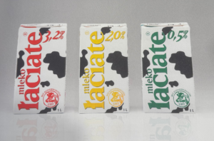
A very interesting example of overall brand branding was a project by the DMB&B Warsaw advertising agency for the “Mlekpol” Dairy Cooperative in Grajewo in 1995. One of the most interesting developments of the early 1990s in Poland was the introduction of new production technologies, a very good example of which, shown in the “Transformations, Modernity in the Third Republic” exhibition, is the design of new packaging for “Łaciate” milk products. Previously, milk was sold in glass bottles or plastic bags. Unfortunately, milk stored this way soured much faster. The production company “Mlekpol” feared that the introduction of homogenized UHT milk in a cardboard, rectangular package would discourage consumers from buying. This was because the milk had a slightly different taste and characteristics than it originally had. The proposed graphics referred to the familiar image of the countryside. Interesting and innovative for the time turned out to be the introduction of a color code to the graphics – red, yellow and green, which informed about the fat content of the milk. The brand’s visual identity itself has remained almost unchanged to the present day and has undoubtedly achieved great success.
Tutti Sofa – Jerzy Langier
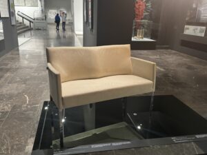
The creator of the Tutti sofa was Jerzy Langier, who founded his company Eljot in 1988. At the beginning, the company produced simple tubular furniture, but at some point managed to sign a contract for subcontract production for a Danish furniture company. The experience gained allowed the company to start its own production of upholstered furniture. Thus, from the late 1990s, the Eljot plant produced sofas and armchairs mainly for public and private representative interiors. The effect of the sofa’s lightness was achieved through the use of slightly curved, rectangular legs and arched upholstery guided over the entire piece of furniture. The Tutti sofa is still produced to this day, but already under a different brand, as the Eljot company was purchased in 2008 by the Nowy Styl company in Krosno.
Oskar Zięta / Skateboard Bolide
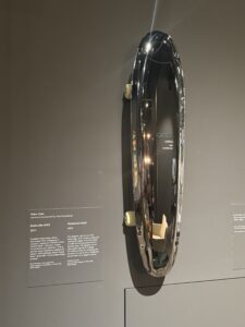
The FIDU technology, in which the Bolid skateboard was made, was developed by Oskar Zięta in 2003. This interesting and original technology consists of cutting and welding the edges of two thin steel sheets, and then sphericalizing them by forcing air between them under high pressure. Most interesting is the fact that each time the created lump can take a different shape. The first skateboards were commissioned by the Pirelli company store in Milan. They complemented the company’s exhibition at the annual fair and made a symbolic reference to mobility. Oskar Zięta later designed and produced many other products using FIDU technology. The flagship, and one can safely say at this point already iconic, is the PLOPP (Polish People’s Object Pumped with Air) stool. Zięta’s works are an excellent example of how technological aspects and artistic qualities can successfully go hand in hand.
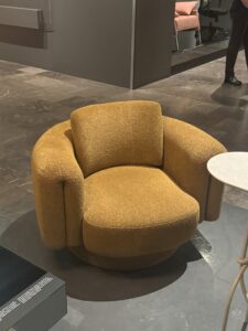
Bofii armchair / designed by Grynasz Studio for Bizzarto brand
The Bofii armchair was designed by design duo Marta Niemywska-Grynasz and Dawid Grynasz for the Bizzarto brand in 2022. The name and design of the armchair refers to the name and work of the Catalan postmodern architect Ricardo Bofill. The armchair is distinctive yet minimalist, which is why it is so popular as an interior decoration mainly
residential. The armchair itself is made of the highest quality materials, fleshy upholstery with a thick weave wraps the person sitting on it thanks to comfortable armrests. The armchair is offered in two versions – all upholstered or with a veneered base.
Vases from the Barva series / Magda Jurek
Magda Jurek founder of the Ms. Jurek brand is an artist who is not afraid of color and all her work is based on combining different colors. The exhibition “Transformations. Modernity in the Third Republic” includes, in addition to the already iconic lamps from Ms. Jurek, vases from the Barva series, which were created in 2023. The artist created the drawings, which she then spatialized to create a collection of three ceramic vases. Ceramics allow for hues, gradients and depth of color that could not be achieved with any other technology. The surfaces of the vases are matte or glossy.
NEOMODERNIZM
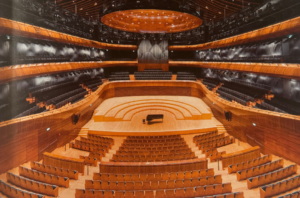
Headquarters of the National Polish Radio Symphony Orchestra in Katowice.
(design: 2008, completion 2014)
Tomasz Konior – Konior Studio (architectural design) – Nagata Acoustics (acoustic design).
“Whatever time and space mean, place and event mean more.” The quote by architect Ald van Eyck perfectly describes the Philharmonic, which is the most awarded architectural structure in Poland. The area around the NOSPR is a public space that has been arranged on the site of the wood square of the former “Ferdinand” mine. The space includes fountains, musical toys, a maze or gardens, which help to further feel and explore the space around the NOSPR in different ways. Anyone who has attended a concert at the NOSPR headquarters in Katowice at least once knows that it is absolutely unique in the world. The building itself is characterized by polyphony of materials, textures, colors and sounds. The building makes a strong reference to Silesian architecture through the use of brick in seven varieties, brown and rough versus glazed and red. The interior of the concert hall gives the impression of a gigantic stringed instrument, inspired by the finesse and shimmering golden wood of a Stradivarius violin.
Promotional emblem Teraz Polska
In 1991, several state institutions supported the initiative to create an organization whose goal was to promote Polish entrepreneurship, mainly in the country. A year later, a competition for the name and logo of the new venture was announced. More than six hundred logo designs and more than one hundred and twenty slogan proposals were submitted. The author of the Teraz Polska slogan was actor Wiktor Zborowski, while the creator of the logo itself was Henryk Chyliński, a graphic designer known for his designs for PKN Orlen and Polish Radio, among others. The inscription itself was attached to the logo only later, already without the participation of its author. Between 1993 and 2024, nearly eight hundred awards were given out as part of thirty-four editions of the program. The logo directly refers to the Polish flag, and its characteristic “wavy” line symbolizes the desire for change and hope for a new order that accompanied the political transition. The mark quickly became a recognizable symbol that Poles, hungry for visible success after years of crisis, could easily identify with.

Whisbear teddy bear humming machine
2014
Design: Maria Czapska
Feature development: Julia Sielecka-Jastrzębska, Zuzanna Sielecka-Kalczyńska, Edwin Sielecki
As a mom, I absolutely wanted to include the “Noisy Bear” in the list.
The idea for the “device for putting babies and children to sleep” comes from developmental theory, which draws attention to the sleep-inducing and calming effects of noise, which infants are still familiar with from their fetal life. When introducing “Shumis” to the market, the young producers had young children themselves at the time, and the inspiration for introducing this type of product came from their children’s reactions to the noise of the dryer. The designer, Maria Czapska in the Whisbear project referred to children’s drawings and proposed a simplified cuddly toy that included distinctive colors and rustling elements to stimulate infants’ sensory experiences. The teddy bear’s paws include two magnets that allow the cuddly toy to be attached to a baby carriage, for example. In subsequent years, new improvements were made, for example, combining the toy with an app. The toy has won many awards both in Poland and abroad and is sold with great success.

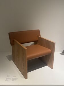
Lucretia armchair
Maja Ganszyniec design for private label NURT
The Lukrecja armchair was designed by Maja Ganszyniec for NURT’s own brand in 2023. The brand has been running since 2018, and the armchair itself complemented the existing collection fully in line with its DNA. The armchair is produced thanks to local materials. The author herself describes the armchair as a reference to modernist and even brutalist design. The armchair is very minimalist, but at the same time comfortable thanks to the backrest that has been let out beyond the contour of the body, so you can rest your elbows comfortably.
MANY
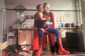
Elizabeth Jablonska excerpt from the Supermother series
2003
I couldn’t help but begin my analysis of “Polyphonic” other than by placing Elzbieta Jablonskaya’s work first. The artist depicts herself in a Superman costume, sitting on a stool in her own apartment and holding her son Antek on her lap. In other photos from the Superman series, Elzbieta still appears in the costume of Batman and Spider-Man. Elzbieta Jablonska compares well-known American pop-culture figures identified with heroism and heroism, to the everyday role of a mother. Here the author uses the language of critical grotesque, turning the comic book world inside out: where the heroine becomes a woman, and the scene of action is a private room, and the action taken is hugging a child. Ordinary everyday life and raising a son are shown here as the greatest challenge and a manifestation of heroism, which only the titular “supermother” can cope with. The artist emphasizes the value of family life and all that it entails – affirming the often overlooked work for the home and loved ones and the satisfaction that comes from it. The frame was composed according to the principles of representational portraiture, with a clear emphasis on symmetry, which gives the scene a solemn, almost ceremonial character.
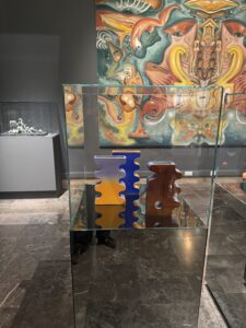
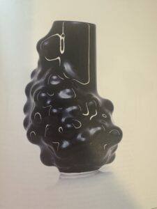
Arkadiusz Szwed – Vase Bumps 2.0
2020
The cobalt vase is one of four vessels available for sale on the author’s website. The set includes: two vases of different diameters, a platter and a cup. All the pieces are united by the same molding method. As the designer admits, he became the owner of a large number of balls from a fashion show quite by accident. Inspired by this find, he began to experiment – he put a flexible material on a cylinder, under which he poured the balls. Moving them around, he gave the mold different shapes, from which he chose the most interesting ones to make disposable casting molds.
He used gypsum for casting, which, as a mold-making material, perfectly reproduced the shapes and bulges of the balls, giving the dishes a unique visual character. As a result, each piece differs from the previous one, although the method of making them remains the same. Although the dishes also have a utilitarian function, it is secondary – the main role of these objects is decorative. Their distinguishing feature is the uniqueness of form and artistic expression.
In addition to being presented at festival exhibitions, fairs and galleries, the dishes often find their way to interior designers, who use them as design elements for apartments for sale.
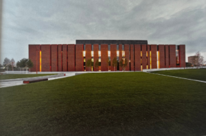
Błonie marketplace
Architectural studio Aleksandra Wasilkowska
Design: 2021, Implementation: 2022
Author collaboration: Monika Oleśko, Karolina Kotlicka, Agnieszka Łańko, Alicja Rudowska
Landscape architecture: Aleksandra Wasilkowska
The project was commissioned by the Municipality of Blonie, specifically the Municipal Services Department in Blonie.
Personally, this project is a perfect example of what public architecture should look like. Here everything comes together. The effect is sensational.
The marketplace in Blonie is a modern, multifunctional space, combining commerce, a meeting place and micro-entrepreneurship. The project is distinguished by its aesthetics, open architecture, accessibility and concern for the environment and the local community. Elements of the site’s identity, such as the mural with the name “Błonie,” have been preserved, and the area has been leveled and covered with a bright reflective pavement that also serves a retention function.
Retail and administrative pavilions were arranged around the canopies, and the center included integration zones, a communal table and a playground. The project strongly emphasizes greenery and biodiversity – plantings include pines, hornbeams, flower meadows and fruit trees, among others. Harvested rainwater goes into special rain gardens. It’s a friendly micro-world that responds to contemporary needs to redefine marketplaces and public spaces
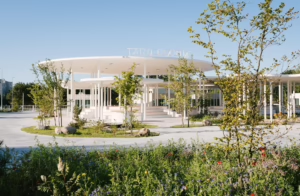
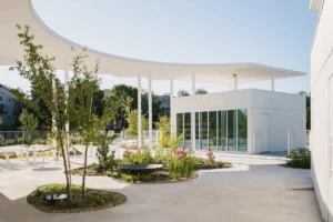
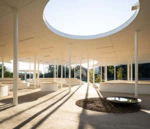
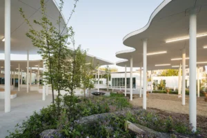
Photos are from the website of Aleksandra Wasilkowska Architectural Studio: wasilkowska.com
The exhibition will be available until May 18, 2025.
Author: Aleksandra Lamot


